


 English
 German
- PRODUCTS
- Voxco Research
- Voxco Intelligence
-
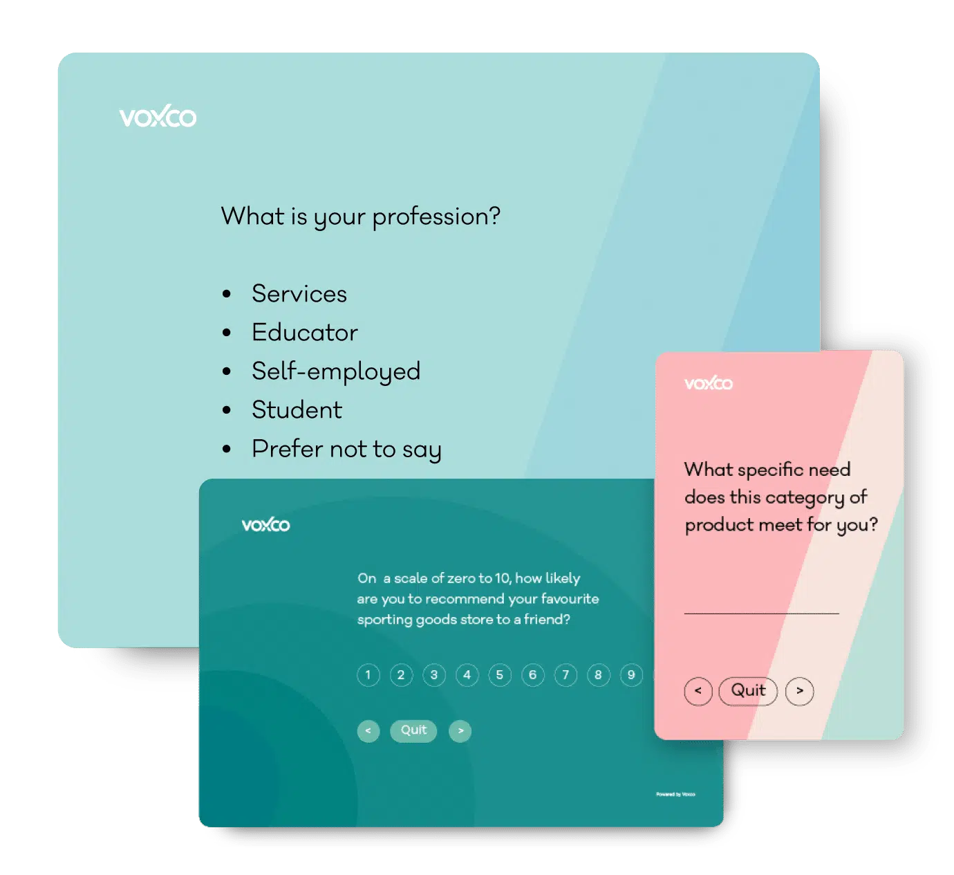
Find the best survey software for you!
(Along with a checklist to compare platforms)
- FEATURES
-
-
-
Take a peek at our powerful survey features to design surveys that scale discoveries.
-
-
- SOLUTIONS
-
-
-
Explore Voxco
Need to map Voxco’s features & offerings? We can help!
-
-
- RESOURCES
-
-
-
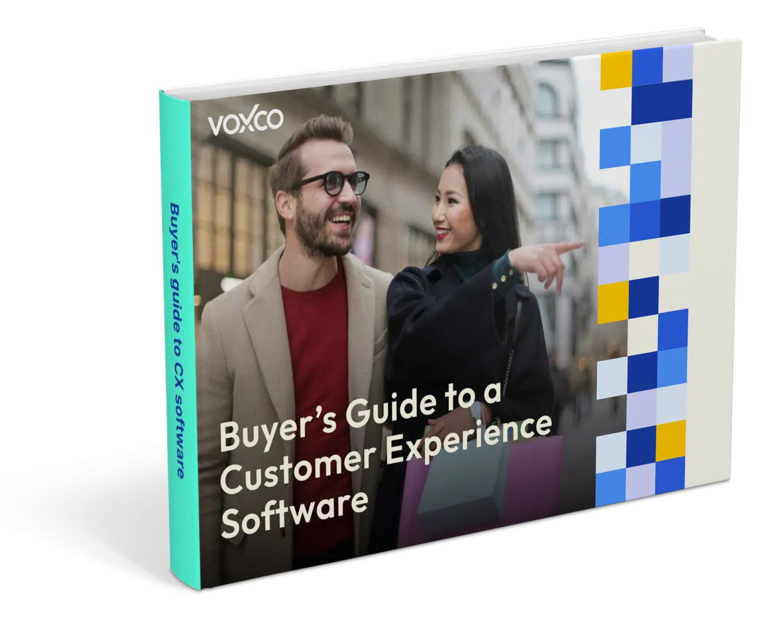
Find the best customer experience platform
Uncover customer pain points, analyze feedback and run successful CX programs with the best CX platform for your team.
-
-
- OUR CLIENTS
-
-
-
"
We’ve been avid users of the Voxco platform now for over 20 years. It gives us the flexibility to routinely enhance our survey toolkit and provides our clients with a more robust dataset and story to tell their clients.
Steve Male
VP Innovation & Strategic Partnerships, The Logit Group
-
-
-
-
- COMPANY
- PRICING
- CONTACT US
-
-
-
Explore Regional Offices
-
-
-
-
-
- PRODUCTS
- Voxco Research
- Voxco Intelligence
-
Find the best survey software for you!
(Along with a checklist to compare platforms)
- FEATURES
-
-
Take a peek at our powerful survey features to design surveys that scale discoveries.
-
- SOLUTIONS
-
-
-
Explore Voxco
Need to map Voxco’s features & offerings? We can help!
-
-
- RESOURCES
-
-
-
Find the best customer experience platform
Uncover customer pain points, analyze feedback and run successful CX programs with the best CX platform for your team.
-
-
- OUR CLIENTS
-
-
- "
We’ve been avid users of the Voxco platform now for over 20 years. It gives us the flexibility to routinely enhance our survey toolkit and provides our clients with a more robust dataset and story to tell their clients.
Steve Male
VP Innovation & Strategic Partnerships, The Logit Group
-
-
- COMPANY
- PRICING
- CONTACT US
-
-
Explore Regional Offices
-
-
-
- PRODUCTS
- Voxco Research
- Voxco Intelligence
-
Find the best survey software for you!
(Along with a checklist to compare platforms)
- FEATURES
-
-
-
Take a peek at our powerful survey features to design surveys that scale discoveries.
-
-
- SOLUTIONS
-
-
-
Explore Voxco
Need to map Voxco’s features & offerings? We can help!
-
-
- RESOURCES
-
-
-
Find the best customer experience platform
Uncover customer pain points, analyze feedback and run successful CX programs with the best CX platform for your team.
-
-
- OUR CLIENTS
-
-
-
"
We’ve been avid users of the Voxco platform now for over 20 years. It gives us the flexibility to routinely enhance our survey toolkit and provides our clients with a more robust dataset and story to tell their clients.
Steve Male
VP Innovation & Strategic Partnerships, The Logit Group
-
-
-
-
- COMPANY
- PRICING
- CONTACT US
-
-
-
Explore Regional Offices
-
-
-
-
-

