

The Voxco Answers Anything Blog
Read on for more in-depth content on the topics that matter and shape the world of research.


Five Takeaways from a Research Tech CEO on AI, Rigor, and Research (2026)
In a recent episode of the Insight Platforms Founders & Leaders podcast, Daniel Graff-Radford, CEO of Discuss, shared his perspective on where research technology is headed. The conversation ranged from AI hype cycles to blending qualitative and quantitative methodologies, but the through line was clear: the industry is in transition, and not all of the assumptions we’ve operated under still hold.
AI is accelerating expectations. Research cycles are compressing. Buyers are demanding both speed and depth. But according to Daniel, the real shift isn’t about replacing researchers or reinventing everything overnight. It’s about integrating AI in a way that strengthens methodology rather than shortcuts it.
Here are five key takeaways from the conversation.
Takeaway 1: AI Will Be the Default, But Not the Replacement
There is little debate that AI will become embedded in research workflows.
As Daniel put it: “AI-assisted research is going to be the default… it won’t change the need to have trust, rigor, and human voices at the center of those decisions.”
AI is becoming infrastructure. It will accelerate analysis, surface connections across datasets, and support continuous insight generation.
What it will not do is replace the researcher.
The more extreme vision — fully autonomous research cycles driven by synthetic respondents and AI-only interpretation — is something Daniel rejects outright:
“The idea that you’ll have AI synthetic data talking to AI researchers providing true insights is actually not a real thing. I think that is a silly dystopian future.”
Research exists because human opinions shift, markets evolve, and context changes. Capturing and interpreting that movement requires judgment. AI can assist, but it cannot substitute for that responsibility.
Takeaway 2: The Trade-Off Between Rigor and Speed Is Outdated
For years, research teams have operated under an implicit belief: if you want rigor, you accept slower timelines. If you want speed, you compromise depth.
Daniel challenges that assumption directly:
“We’ve always had this belief that’s no longer true, that rigor and speed are opposites.”
Historically, slower processes were equated with higher quality. More time meant more review, more validation, more methodological discipline.
But in today’s environment, equating slowness with rigor is increasingly impractical.
AI changes the dynamic, not by weakening methodology, but by enabling it to operate more efficiently. When embedded thoughtfully, AI reduces manual friction and accelerates synthesis without bypassing important steps.
However, Daniel also cautions against pursuing speed for its own sake:
“There is a desire to try to go too quickly and then you miss the insights for the slickness of the AI.”
The goal is not slick automation. It is a disciplined methodology operating at modern speed.
Takeaway 3: The Future of Research Is Blended, Not Siloed
Another theme from the conversation was the growing demand to combine scale and depth: quantitative measurement with qualitative understanding.
Researchers running large-scale quantitative studies increasingly want to know why certain patterns emerge. At the same time, those conducting in-depth qualitative interviews often want broader validation and scale.
As Daniel described, there is a real opportunity in “mixing the modes of qual and quant” to help customers reach differentiated decisions. The traditional siloed model — separate tools, separate teams, separate outputs — creates friction. Blending methodologies creates continuity.
AI plays a supporting role here as well. By accelerating cross-method synthesis and connecting insights across studies, it makes this blended approach more practical.
Takeaway 4: AI Is a Thought Partner, Not a Shortcut
If AI is not replacing researchers, and if rigor and speed can coexist, the next question becomes: what is AI actually doing inside research workflows?
Daniel’s answer is precise:
“AI as a thought partner in research.”
This positions AI not as a replacement for thinking, but as a collaborator in it.The quality of insight has always depended on the quality of the questions being asked. That dynamic does not disappear in an AI-enabled world.
“The quality of questions that a market researcher asks are so much better than someone that’s not trained in research.”
Experienced researchers know how to frame trade-offs, isolate variables, and interpret nuance. AI can assist by surfacing patterns, connecting prior studies, and accelerating synthesis, but it does not inherently understand context.
As Daniel puts it:
“AI is more of a tool in the hands of that market researcher… a thought partner… rather than something that overcomes needing them.”
The implication is clear: the strongest outcomes will come from skilled researchers working alongside AI, not from automation operating independently.
Takeaway 5: The Future Must Be Built Step by Step
While much of the AI conversation centers on bold future-state visions, Daniel takes a more grounded view. It’s easy to describe a world where researchers can instantly converse with a unified dataset containing every study ever conducted. But that is not the current reality.
“We’re not quite there yet… it’s our job to help light the path to get there.”
Transformation cannot be achieved in a leap. Research organizations operate within established workflows, stakeholder structures, and historical systems. Tools must be digestible. Change must be practical.
Daniel also warns that startups often make the mistake of pitching a three-year vision without solving today’s problems. Sustainable innovation requires grounding, not just ambition.
The future of research will be built incrementally, with each step strengthening methodology rather than discarding it.
Conclusion: Amplification, Not Automation
Across the conversation, one theme remains consistent: AI is reshaping research, but not by eliminating its foundations.
It will be embedded in workflows. It will accelerate synthesis. It will enable teams to operate with greater agility.
But it will not replace rigor.
It will not replace human judgment.
And it will not replace the trained researcher.
The next era of research is not autonomous. It is amplified.
Researchers who embrace AI as a thought partner, who blend qualitative depth with quantitative scale, and who move at modern speed without sacrificing discipline, will define what comes next.
And in 2026, that balance may matter more than ever.
Thank you for being a loyal follower of Voxco and Ascribe news. Please begin following Discuss on Linkedin to stay in the loop on new features, AI innovation, and customer success.
Read more
%20(1200%20x%20924%20px).png)
The Latest in Market Research
Building the Future of Research, Together
Today marks the beginning of an exciting new chapter for our industry and for the teams behind Discuss, Voxco, and Ascribe.
By coming together, we’re creating something I believe the research world has been waiting for: a connected system that unites qualitative depth, quantitative scale, and AI intelligence in one flow. It’s the next evolution in how we understand people and how we make decisions with confidence.
Bringing these teams together feels less like a merger and more like completing a puzzle with every piece finding its place to create a bigger picture of how research should work.
Discuss brings the art and empathy of qualitative research -- the ability to see what people feel and why -- and pairs it with world-class AI innovation that makes that understanding faster, richer, and more scalable than ever before. Voxco adds the scientific rigor, reach, and credibility of decades of quantitative expertise, including the precision that ensures insight is both grounded and representative. And Ascribe contributes the power of AI analytics, giving us the connective tissue that turns language into structure and structure into clarity.
Why We Chose the Discuss Brand
We chose the Discuss name because it represents what we deeply care about: genuine human understanding. The Discuss brand already stands for quality, innovation, and empathy. It captures the essence of what research should be: a dialogue, going beyond a dataset.
As a team that has spent years in the quant world, we’ve seen how easy it is for technology to make research efficient but impersonal. What I love about Discuss is that it’s the opposite. It keeps people at the center, even as AI accelerates the work around them. That balance between speed and humanity is the foundation for where we’re going next.
A New Opportunity
When we brought together Voxco and Ascribe in 2024, we began to glimpse what was possible when quantitative rigor met the nuance of qualitative understanding. And when Discuss joined us, that vision expanded into something far greater, a new horizon where insight moves at the speed of curiosity. Together, we’re creating a world where technology illuminates meaning. Our new opportunity is clear and full of purpose: to give every researcher the superpowers to turn curiosity into clarity.
Gratitude to Simon Glass and the Discuss Team
I want to take a moment to express my deep gratitude to Simon Glass and the entire Discuss team. They’ve built something truly special: a company defined by elegance, empathy, and relentless customer focus. I’m thrilled that Simon will continue to work closely with me and the full Discuss leadership team as an advisor. In my new role as CEO of Discuss, his partnership and support will ensure that the spirit and excellence that define Discuss remain at the heart of everything we build together.
The Vision and Support of Terminus Capital Partners
This milestone wouldn’t have been possible without the vision and partnership of Terminus Capital Partners (TCP). Their belief in the power of modern, integrated research technology gave us the ability to evaluate dozens of potential partnerships and to pursue the ones that could truly transform the industry. Discuss clearly stood apart not only for its innovation and leadership in AI, but for its commitment to customer success and its human-first approach to technology.
The Power of AI: Giving Researchers Superpowers
AI is the foundation for a new era of research. It’s what allows teams to see more, connect more, and decide faster, without losing the human context that gives data meaning.
What excites me most is what AI unlocks for serious researchers. The combination of Discuss, Voxco, and Ascribe is giving them something they’ve never had before: the ability to get quality answers they can trust by moving fluidly between depth and scale, from conversation to quantification, all inside one system built for clarity and connection.
With Discuss, we bring an AI-powered platform proven to deliver both speed and human depth. Our agents for interviewing, insights synthesis, and project design already enable teams to run global research at the pace of decision-making. Whether studies are human-led, AI-moderated, or a blend of both, Discuss turns qualitative insight into an always-on source of learning.
With Voxco, we add the quantitative engine with our legacy of expertise in survey design, data collection, and automation that give researchers the reach and statistical rigor to validate what they see.
And with Ascribe, we integrate advanced AI analytics including automated open-end coding, sentiment analysis, and cross-project intelligence that turn words into patterns, patterns into predictions, and predictions into action.
Now picture these capabilities working as one system.
A researcher frames a question and the system does what used to take multiple tools and teams. Voxco’s survey engine finds and fields the right audiences across channels and geographies, capturing the quantitative signals that ground every decision. Discuss’s AI Agents help them launch human or AI-moderated interviews to uncover the stories and emotions behind those numbers. Ascribe’s analytics then connect it all, decoding open-ends, mapping sentiment, and surfacing patterns that tie what people say to what they do.
In a single environment, researchers can design, collect, and connect, moving fluidly from exploration to validation, from data to understanding. It does more than analyze information. It learns from it, enriching the next question and deepening every answer.
This is just the beginning.
Click here to read the full press release.
Daniel Graff-Radford
CEO, Discuss
Read more

Text Analytics & AI
The Latest in Market Research
Why CATI and Offline Surveys Still Matter in an AI-Dominated World
In a World Obsessed with Automation, Human Connection Still Counts
Have you ever tried to reach customer support, only to get stuck talking to a chatbot that can’t quite understand your problem? You rephrase your issue, try a few keywords, maybe even hit “Other” twice, and still end up with a scripted response that doesn’t help. You end the chat feeling unheard.
Situations like that remind us that technological progress means little if we lose human touch along the way.
The same tension exists in research. AI can process vast amounts of data, predict behavior, and summarize open-ends in seconds. But when the goal is to understand why people think or act a certain way, automation alone falls short. Human-centered research methods like computer assisted telephone interviewing software (CATI) and offline surveys bridge that gap. They invite conversation, clarify meaning, and uncover the emotion behind each response.
AI can amplify research in remarkable ways, but there will always be voices, contexts, and conversations that only CATI and offline methods can reach.
Beyond Automation: The Role of Human Intelligence in Research
When researchers rely solely on AI, they risk missing the subtle cues that define real understanding. Human-led methods like CATI and offline interviewing capture these cues, emotion, tone, hesitation, that give data depth and authenticity.
At Voxco, we call this the balance of AI + HI (Artificial Intelligence + Human Intelligence).
- AI can flag emotional tone, but only people can ask why someone feels that way.
- AI can record every word, but only people can read between them.
The future of research isn’t man versus machine. It’s about using both, AI for efficiency, humans for empathy.
CATI in the AI Era: Smarter Calls, Deeper Insights
CATI has always been about more than a script. It’s a live conversation that builds trust, clarifies meaning, and captures what online surveys often miss. Today, AI is transforming how those conversations happen.
Here’s what modern CATI looks like:
- AI-assisted dialers optimize call timing and reduce idle time.
- Real-time transcription tools capture every word accurately.
- Voice analytics detect emotional tone and engagement.
- AI-driven coding tools, like Ascribe, instantly summarize open-ended feedback.
What remains unchanged is the human role. Interviewers still adapt to the moment, sense when to probe deeper, and navigate complex emotions. AI handles the repetitive work so that researchers can focus on what truly matters: listening and interpreting.
Offline Surveys: The Unsung Hero of Data Completeness
Even in an age of hyperconnectivity, not everyone lives online. Many communities such as rural populations, older adults, or regions with limited infrastructure, are still best reached in person. Offline surveys keep these voices in the dataset.
Offline data collection plays a vital role in:
- Healthcare and social studies, where context, empathy, and trust matter.
- Field research in remote areas, where internet access is unstable.
- Post-disaster assessments, where quick, direct input guides real-time decisions.
With AI-enabled offline tools, researchers can now collect and sync data seamlessly. Mobile survey apps can:
- Encrypt and store data securely offline.
- Flag inconsistencies or outliers instantly.
- Sync findings automatically once a connection is restored.
Offline doesn’t mean outdated, it means inclusive. It ensures research reflects every voice, not just those with reliable Wi-Fi.In a world where representativeness defines credibility, offline surveys remind us that good research starts by showing up where people are.
Combining AI and Traditional Research Methods for the Future
The future of research isn’t about choosing between automation and authenticity. It’s about knowing how and when to use both.
AI and traditional survey methods now work hand in hand to create faster, fuller, and more reliable insights. CATI interviews feed AI-driven text analysis. Offline survey data syncs seamlessly into central dashboards. Machine learning tools spot anomalies long before they affect data quality.
Think of it as a feedback loop.
- CATI and offline methods capture context and emotion.
- AI tools extract patterns and scale those findings.
- Researchers interpret and validate what truly matters.
When every mode supports the others, the result is an insight process that is both human and high-tech. This is the real meaning of “AI with HI”, a research ecosystem that blends empathy with efficiency.
3 Ways to Future-Proof Human-Led Research
Even as automation expands, the most valuable insights will still come from people who know how to use technology without losing touch with the human side of research. Here are three ways researchers can keep CATI and offline methods future-ready in an AI-driven world:
1. Let AI handle the heavy lifting
Use AI to take care of the tasks that slow you down like scheduling, transcription, and quality checks. Modern CATI and offline tools can automatically log call data, summarize open-ends, and flag inconsistencies before they reach your dataset. When routine work runs in the background, researchers can focus on what truly matters: asking better questions and interpreting richer answers.
2. Reinvest in human touchpoints
Use CATI and offline surveys strategically, where tone, timing, or context could shape how someone responds. A well-timed call or in-person conversation can surface the “why” behind behaviors that AI alone can’t decode. It’s not about doing more human research. It’s about using human connection at the moments that matter most.
3. Build a hybrid mindset
The most effective researchers today see all modes — online, CATI, and offline — as part of one ecosystem. When these channels work together, you get a fuller picture of your audience and stronger, more balanced data. Treat AI as your co-pilot, not your replacement. It can accelerate discovery, but it still needs a human to guide the journey.
Conclusion: Innovation Rooted in Connection
CATI and offline surveys aren’t relics of the past. They’re the grounding force of modern research — keeping insights real, representative, and rooted in context. The future belongs to researchers who can blend the two worlds: human instinct and machine intelligence.
That’s where Voxco comes in. Our platform brings every mode together — online, CATI, and offline — in one ecosystem built to help you move faster without losing depth. See how leading research teams use Voxco to combine AI power with human precision. Book a demo now.
Read more

The Latest in Market Research
Text Analytics & AI
The Genius in the Basement Can't Save Us This Time: From DIY to AI Partnership
Picture this: It's 2 AM, and somewhere in the basement of a survey research firm, a single programmer is hunched over three monitors, empty energy drink cans scattered around like digital tumbleweeds. The client needs the impossible by morning: custom quota logic that shouldn't exist, a data export format that defies reason, and a survey flow that would make a PhD in logic weep.
But somehow, Fariborz makes it happen.
You know Fariborz, don't you? Perhaps at your company, he goes by Suresh, Bill, Larry, or Nate. Every survey organization has its "guru in the basement," that brilliant, slightly mysterious programmer who could make CATI systems sing opera and web platforms perform circus tricks. Our secret weapon, these programmers could turn a client's "absolutely impossible" into "done by Monday, with documentation."
For decades, this culture of homegrown ingenuity was our competitive edge. It carried us through every seismic shift in our industry: from paper questionnaires to computer-assisted telephone interviewing (CATI), from CATI to mixed-mode approaches, from mixed-mode to the digital revolution. And it worked beautifully because survey transitions unfolded predictably. The underlying mathematics remained constant, the logic was deterministic as clockwork, and a single clever programmer could keep an entire operation running smoothly for years with only occasional maintenance.
When clients needed customization, the requirements were reasonably clear: skip patterns that made sense, custom exports in familiar formats, quota logic that behaved rationally. The genius sat just down the hall, so fixes were fast, affordable, and almost always worked precisely as intended. It felt like having a Swiss Army knife that could solve any problem.
But then came AI. And suddenly, the very model that made us nimble may now be putting us at extraordinary risk.
The Day Fariborz Met His Match
AI isn't just another software upgrade or another tool in our familiar toolkit. It's a fundamentally different creature that plays by entirely different rules.
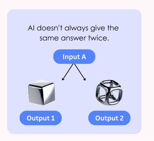
Unlike the deterministic systems we’ve grown comfortable with, AI, particularly Generative AI, is inherently non-deterministic. Feed it the same input on Tuesday that you fed it on Monday, and you might get a different output. Not because something is broken, but because that's how these systems work. Designed to mimic human "thinking," which, as we know, is not always predictable.
Moreover, AI systems demand constant care and feeding in ways that traditional software never did. Models “drift” as language evolves, populations shift, or new versions are released. What worked well for your automated open-end question coding in January might be subtly failing by June, and you won't necessarily know unless you're actively monitoring it.
Perhaps most unsettling of all, AI often can't explain its own decisions. Without sophisticated tools for interpretability, you may never understand why your model classified a response one way rather than another. As I've argued extensively in Beyond the Black Box, AI systems must be transparent, auditable, and explainable, not just for ethical reasons, but for practical ones.
As I warned in The Fourth Firefly Problem, if we're not vigilant, we can completely lose sight of minority voices and rare but critical cases. The terrifying part? We might never even realize what we've lost.
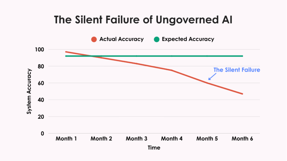
The bottom line is stark: you cannot "set and forget" an AI system the way you could with traditional survey software. And this time, there is no Fariborz working magic in the background. These systems require continuous monitoring, regular retraining, and ongoing governance, or they will quietly fail you in ways you won't discover until it's far too late.
Why AI Fails Quietly
I've seen what happens when governance isn't in place, and it should keep any research director awake at night.
One organization I spoke with built a DIY text classifier to code open-ended responses. For months, it worked beautifully: faster than human coders, more consistent, cheaper. Leadership was thrilled.
After six months, during a routine audit, they discovered the system had gradually stopped classifying Spanish-language responses correctly. No alerts. No dashboard warnings. No red flags. More than 400 Hispanic respondents had been systematically misclassified, their voices distorted in the data.
This silent failure had been happening for months before anyone noticed. That's the insidious danger of ungoverned AI. Systems don't typically crash dramatically. Instead, they drift away from accuracy, taking your data integrity with them. Model drift degrades outputs without warning. Bias creeps in slowly, overlooking minority groups or amplifying stereotypes. The talent burden alone is staggering, you need data scientists, ML engineers, and compliance specialists, not just a few clever programmers.
Then there's regulatory exposure. GDPR and HIPAA demand clear documentation of how your models work and protect data. NIST's framework may be “voluntary,” but try explaining that to clients when your AI system fails an audit. Can your basement genius provide that while keeping the lights on?
The lone genius can't carry this weight anymore. Expecting them to is both unfair and dangerous.
Where DIY Still Makes Sense
Don't panic. DIY isn't completely dead. It still works perfectly for:
- Pilots & experiments where you're learning and testing
- Niche internal tools solving particular workflow problems
- Prototypes that help you figure out what's worth real investment
But once your homegrown tool becomes client-facing, compliance-critical, or mission-essential? The stakes change completely.
Why Strategic Partnerships Matter
This is why teaming has become crucial. There are companies whose entire business revolves around survey platform development, and today, that means keeping up with AI's relentless pace.
These organizations maintain dedicated teams focused on tracking model developments, building MLOps pipelines, monitoring for drift and bias, and staying current on rapidly changing privacy regulations. Most importantly, their business model depends on doing this well continuously.
When you partner with platform specialists, your team can focus on what truly differentiates you: understanding respondents, serving clients, and advancing survey science.
Practical Governance Without Losing Your Mind
Even when you partner with AI specialists, governance remains your responsibility. The good news? Effective AI governance doesn't require a PhD in machine learning or a massive budget.
Here's your practical starter kit:
- Benchmark performance: Set a baseline accuracy rate at launch and then recheck it quarterly to ensure ongoing consistency. No exceptions.
- Flag the outliers: Create processes for human review of unusual outputs. These edge cases often reveal problems before they spread.
- Audit for bias: Test cases across key demographic subgroups. If outputs vary inappropriately, you'll catch it early.
- Document everything: How it was trained, when it was updated, and what metrics you monitor. This is no longer optional; it's now required.
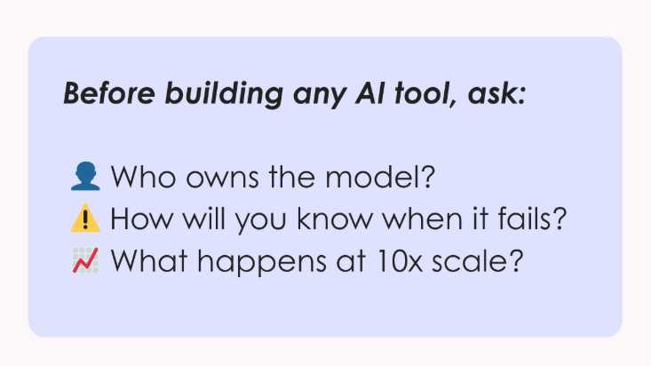
The Three-Question Test
Before you build any new AI tool, run this simple test. If you can't answer all three confidently, stop building:
1. Who owns this model after launch?
Name the specific people responsible for monitoring, retraining, and validation. "The team" isn't an answer.
2. How will you know when it fails?
AI failures are silent. What alerts or dashboards will catch problems before clients see them?
3. What happens at 10x scale?
Can your infrastructure, staff, and governance handle ten times the workload without breaking?
Can't answer these with specifics? That's your signal to either strengthen your governance or partner with someone built for this complexity.
Bottom Line
The basement genius era isn't coming back, at least not for AI. We need to build research ecosystems where human experts and AI work together safely, transparently, and at scale.
Fariborz was our secret weapon for decades. But who's watching the models now? Are you confident they'll still be accurate in six months?
The most significant risk isn't building too slowly. It's building without guardrails, deploying systems that work beautifully until they silently fail, taking your data integrity down with them.
The models need their own watchers. Can you afford proper AI governance? Better question: can you afford not to have it?
Read more

The Latest in Market Research
Why Researchers, Not Algorithms, Must Stay at the Center of AI
Too often, AI in research still feels like a black box. Data goes in, answers come out, and no one can explain how those answers were generated. I have seen firsthand how this leaves research teams questioning whether they can trust the results. For AI to be useful, it must produce outcomes that are reproducible, transparent, and reliable.
Our Philosophy for Responsible AI
At Voxco, we believe AI should create the conditions for better judgment, not attempt to replace it. The real value of AI is unlocked when it works alongside skilled researchers who bring context, challenge assumptions, and decide what truly matters.
Michael Link, PhD, one of the leading voices in market research, notes that while more than 70 percent of teams now use AI, fewer than 10 percent validate the results. That gap is exactly why responsible AI matters. Our philosophy is simple: AI should expand what researchers can do without taking control away from them. With the right safeguards, AI can lift the weight of repetitive tasks and open opportunities to test more markets, analyze more data, and explore more questions within the same budgets.
History shows that the best technologies don’t erase expertise, they extend it. Just as word processors made it easier to write but did not remove the need for good thinking, AI accelerates analysis while relying on human oversight to make meaning. Researchers remain at the center, steering the work. That balance ensures insights are not only faster, but also rigorous and trustworthy.
A Practical Playbook for Researchers
The conversation around responsible AI often gets abstract. In my experience, here are three rules worth following:
- Use AI for scale, not judgment.
AI excels at volume. It can probe survey respondents in real time, code thousands of open-ends in hours, or scan comments for emerging themes. These are the tasks that once held teams back because they were slow and expensive. But AI does not know which themes matter or what to do with them. I have seen teams mistake prediction for meaning, and the result is always misleading. The lesson is clear: use AI to remove bottlenecks, but never hand over judgment. That is the role of the researcher.
- Validate early and often.
The danger of black-box AI is not just speed, it is false confidence. If you cannot reproduce an answer or explain how it was produced, you cannot rely on it. Research teams should treat AI outputs the way they treat any other dataset: benchmark them, compare them, and test them against known truths. When clients do this, they gain confidence that AI is not just producing results quickly, but producing results they can stand behind.
- Keep humans in the loop. Always.
Researchers need to be part of every step in the process, with the ability to review, edit, and challenge outputs. In practice, this is what prevents bias from slipping through, or an outlier from being ignored. I often describe this as the difference between AI as an assistant and AI as a decision-maker. The first expands what is possible. The second is a risk no organization should take.
These are not complicated ideas, but they change the way AI works in practice. You can see them reflected in the tools we’ve developed at Voxco.
In Action: Tools That Reflect Our Philosophy
Responsible AI is only valuable if it is applied in real workflows. That is why we have built tools that take the weight off repetitive work while keeping researchers in control of the results.
- Ascribe Coder accelerates the analysis of open-ended feedback. Projects that once required days of manual coding can now be completed in a fraction of the time, with researchers reviewing and refining the results to ensure accuracy. Clients using Coder have cut turnaround times by up to 90 percent while expanding the scope of what they can deliver.
- Ask Ascribe gives researchers a direct way to query their own data. It surfaces themes, emotions, and summaries on demand, turning large datasets into insights that can be acted on immediately.
- Voxco's AI Probing adds depth to surveys by asking contextual follow-up questions in real time. Instead of vague answers that leave gaps, researchers get richer detail they can rely on.
- AI Survey Import transforms Word documents into structured surveys in minutes. Researchers upload their documents, review the AI's detection of question logic and types, and then adjust before deployment, maintaining full control over the final questionnaire.
In our experience, the distinction between purpose-built and off-the-shelf AI matters greatly. Consumer tools may offer speed, but they are rarely designed for the realities of research: the scale of open-ends, the rigor of validation, the sensitivity of client data, or the need to reproduce results with confidence. Our approach has been to build AI with researchers at the center: tools created by people who know every critical step in the research workflow, benchmarked against industry standards, and continually refined through feedback from the research community.
For example, Toluna has reported nearly 90% time savings on coding and analysis, while maintaining consistent, high-accuracy outputs across large, multilingual datasets using AI Coder. By automating netting, enabling theme-based coding, and supporting reusable codebooks, they’ve been able to deliver deeper insights with far greater efficiency. Just as important, researchers remain in control by reviewing, refining, and steering outputs, which ensures that AI enhances judgment rather than replacing it, and that the insights produced are both rigorous and defensible.
Takeaways
AI has the power to accelerate insights, but without human oversight it quickly turns into noise. For organizations, that means asking harder questions of their partners. Can they show how results were produced? Do their tools allow researchers to stay in control? Are outputs transparent enough to be explained and defended? If the answer is no, the risks outweigh the rewards. Selecting partners who treat AI responsibly is not optional.
When AI amplifies rigor instead of replacing it, insights stop being tricks and start becoming decisions you can trust.
Watch the Recording
Voxco CEO Daniel Graff-Radford and Michael Link, PhD, a leading voice in survey research, came together for an in-depth discussion on how to integrate AI responsibly in research.
In Beyond the Black Box: Making AI Work for Survey Research, they explored the biggest risks in applying AI to research and shared a practical framework for using it responsibly, with real-world examples of how human oversight turns fast outputs into trustworthy insights.
Click here to watch the full session.
Read more

The Latest in Market Research
iOS 26 Call Screening: What Market Researchers Need to Know
Apple Just Changed How Unknown Calls Work and Here’s Why It Matters
Apple’s new iOS 26 update has introduced a call screening feature that’s getting a lot of attention (and a bit of concern). The feature asks unknown callers to state their purpose before the phone even rings, giving users a chance to screen calls before deciding whether to pick up.
For researchers who rely on phone surveys, the immediate question is: Will this make it harder to reach respondents?
The short answer: not really. While any change in the way people answer calls naturally raises eyebrows in the research world, the data shows that iOS call screening is more of a subtle shift than a game-changer. Rather than a reason to worry, it’s an opportunity to refine survey practices and embrace a more multi-modal approach.
Before You Worry, Here’s the Reality Check
First, let’s put the scale of this change into perspective. Call screening on iOS 26 is optional and tucked away in the phone’s settings. Unless users go looking for it, most won’t even know it exists.
We’ve already seen a similar rollout on Android — and the adoption rate there has stayed below 4%. In other words, the vast majority of people continue to pick up calls as usual. Industry experts across polling, sales, and customer engagement have echoed the same message: this is manageable.
Yes, a small portion of respondents may choose to enable the feature, but it won’t disrupt the fundamental role of phone surveys. Instead of bracing for a sharp drop in response rates, researchers can focus on small adjustments that make their introductions clearer, more transparent, and more compelling.
Why This Is a Chance to Rethink Your Scripts
Instead of treating iOS 26 call screening as a setback, think of it as a nudge toward better outreach practices. Researchers have long known that the first few seconds of a phone survey call can make or break participation. Now, they matter even more.
4 Ways to Keep Response Rates Strong (Post-iOS 26)
To help teams adapt with confidence, here are four practical steps you can implement today:
- Optimize Your Scripts for Transcription
- Keep introductions short, clear, and easy to transcribe.
- Avoid jargon or filler phrases that don’t translate well in text.
- Verify Your Caller ID
- Use branded caller ID solutions so respondents see your organization’s name and logo.
- Register with verified call registries early to prevent being flagged as spam.
- Add Alternative Contact Methods
- Complement calls with SMS, email, or in-app outreach.
- A multi-touch strategy ensures respondents recognize and trust your outreach.
- Call at the Right Time
- Use data-driven insights to reach respondents when they’re most likely to answer.
- Avoid “blanket” calling schedules — small timing tweaks can make a big difference.
The Multi-Modal Future Is Already Here
Call screening is just one more reminder that research can’t rely on a single channel. The reality is that respondents are already engaging across multiple touchpoints, and the most resilient studies are designed to meet them where they are.
Here’s what that looks like in practice:
- Blend phone with digital. Pair CATI with online surveys, SMS links, and mobile notifications to give respondents more flexibility in how they participate.
- Use phone where it shines. Live calls remain the gold standard for in-depth conversations and reaching harder-to-contact groups but they’re even more effective when reinforced by digital outreach.
- Think digital-first, not digital-only. Industry experts point out that mixed-mode research isn’t a “nice-to-have” anymore, it’s the baseline expectation for modern data collection.
The bottom line: phone surveys aren’t going away. They’re simply becoming one part of a smarter, multi-modal strategy. The organizations that lean into this shift will be the ones that stay ahead.
Wrapping Up: A Small Change, A Big Opportunity
To recap:
- iOS 26 call screening is optional and adoption will be low (under 4% based on Android precedent).
- The real impact is on how we approach respondents, with clearer scripts, verified caller IDs, better timing, and smarter multi-channel outreach.
- This isn’t a threat, it’s a chance to strengthen trust and improve the overall quality of phone survey engagement.
At Voxco, we believe changes like this are opportunities to adapt and innovate. Whether it’s improving your CATI surveys or building seamless mixed-mode studies, we’re here to help you Answer Anything. Ready to see how Voxco can future-proof your survey programs? Book a demo now.
Read more

Text Analytics & AI
The Latest in Market Research
When the Fourth Firefly Lives in Your Data: Detecting AI Changes Before They Skew Results
What a Simple Illustration Revealed About AI Validation
A few months ago, I was generating children's book illustrations using AI. Simple prompt: three fireflies glowing in the summer night sky. Every time, the AI gave me four. No matter how I rephrased the prompt, that uninvited fourth firefly kept appearing.
In an image, that extra firefly was obvious. In a survey dataset analyzing thousands of responses? It could hide for months.
This moment crystallized for me a critical challenge facing survey researchers: AI tools make thousands of micro-decisions in every project - coding sentiment, categorizing demographics, flagging data quality issues - and when these decisions quietly change, they can skew results without any obvious warning signs.
In survey research, your "fourth firefly" might be:
- AI sentiment analysis that suddenly treats "It's fine" as positive instead of neutral
- Demographic coding that starts misclassifying job categories after a routine update
- Text analysis that merges previously distinct response categories without notification
These shifts (in technical terms: model drift, bias evolution, algorithmic alteration) represent the same core problem: AI tools changing behavior in ways that affect research conclusions while appearing perfectly reasonable on the surface.
The insight that changed my approach was realizing that detection matters more than prevention. Rather than trying to freeze AI capabilities in place, we need systematic ways to spot when changes occur and determine whether they represent improvements or problems. Think of AI validation like fact-checking: we don't want to prevent AI from making discoveries, we want to verify which discoveries we can trust.
Three Types of AI Drift (And Why Understanding Them Matters)
Our AI tools change behavior for predictable technical reasons. Understanding these patterns helps us develop appropriate validation protocols:
Concept Drift
- What happens: AI redefines categories as language evolves
- Research impact: Sentiment analysis accurate in 2022 may miscategorize contemporary expressions
Training Data Shifts
- What happens: Model updates incorporate different data sources
- Research impact: Coding frameworks change without explicit notification
Model Degradation
- What happens: Fine-tuning introduces cumulative biases over time
- Research impact: Systematic patterns that appear methodologically sound but aren't
Not all AI changes represent problems; some may reflect genuine improvements in pattern recognition. Our validation frameworks need to distinguish between beneficial adaptations and problematic drift.
Validation Experiences: When Fourth Fireflies Reveal Their True Nature
In teams implementing AI validation, the fourth firefly problem manifests in both concerning and surprisingly beneficial ways. In every case, systematic validation made the difference between hidden changes undermining results and turning them into methodological improvements.
When Fourth Fireflies Cause Problems
Sentiment Drift in Transit Research: A transit satisfaction tracker's AI began coding "It's fine" as positive instead of neutral after a routine update, artificially inflating satisfaction scores. The error was caught only when stakeholders questioned the findings.
Demographic Inference Bias: A policy research organization's AI tool misclassified gig economy jobs after incorporating unvetted training data, skewing labor estimates enough to alter policy recommendations. The error was discovered when results failed to align with benchmark data.
When Validation Reveals Valuable Discoveries
Demographic Classification Evolution
In a national survey, a quarterly model review flagged an increase in respondents classified as "Hispanic/Latino" by the AI text classifier. The change was traced to an update incorporating expanded language patterns and name combinations.
Rather than reverting, the team compared AI classifications to self-reported ethnicity and ACS benchmarks. The model was correctly capturing previously missed respondents - particularly multi-ethnic and newer immigrant groups - but over-classifying in areas with high Hispanic surname prevalence. By retaining the expanded coverage but adding a brief self-identification confirmation question, the team increased accuracy while preventing bias.
Consumer Language Evolution
In a brand tracker, AI began merging "value" and "price" responses historically coded separately. Split-sample testing revealed consumers increasingly used these terms interchangeably ("It's not worth the price," "Good value for the money"). The solution merged categories in the primary structure while adding sub-tags for trend continuity, reflecting real-world language shifts without losing historical comparability.
Five Essential Components of AI Validation
From our experiences with research teams developing validation approaches, these elements appear essential for any comprehensive framework:
1. Real-Time Pattern Monitoring
Statistical process control methods that flag when AI outputs deviate significantly from established baselines, enabling rapid investigation of unexpected patterns.
2. Demographic Consistency Testing
Systematic evaluation of AI decisions across protected classes ensures consistent choices regardless of respondent demographics while detecting genuine group differences.
3. Comparative Validation Studies
Parallel analyses using AI and traditional methods provide benchmarks for assessing when algorithmic approaches offer advantages and when they require correction.
4. Comprehensive Decision Documentation
Detailed logging of AI choices enables peer review and replication, though this creates additional documentation requirements for project planning.
5. Researcher Oversight Integration
Critical methodological decisions require explicit researcher review, with the challenge being efficient oversight rather than bureaucratic barriers.
Different research contexts will require different levels of oversight intensity, balancing comprehensive validation with practical implementation efficiency.
Moving Forward as a Research Community
The fourth firefly problem represents both a challenge and an opportunity for our field. Without systematic validation approaches, we risk two equally problematic outcomes: becoming so cautious that we miss AI's transformative potential, or rushing ahead without sufficient oversight and compromising research quality.
Our profession has successfully navigated major methodological transitions before: from paper to digital surveys, from landline to mobile data collection. This transition requires the same thoughtful approach: systematic validation, shared learning, and collective standard-setting.
Here's how to start building your validation capabilities:
Immediate Steps (Next 30 Days)
- Audit your current AI usage: document every AI decision point in your methodology
- Establish baseline measurements for AI outputs before implementing changes
- Create a simple monitoring system to flag unexpected pattern shifts
Building Long-Term Capabilities (Next Quarter)
- Develop split-sample testing protocols to compare AI and traditional methods
- Train your team to recognize the three types of AI drift discussed above
- Implement the five essential validation components that fit your project scale
Advancing Industry Standards (Ongoing)
- Share validation experiences with peers—both successes and failures advance our collective knowledge
- Advocate for AI transparency standards with your technology vendors
- Participate in professional discussions about best practices
The most successful research teams treat AI validation as a professional development opportunity rather than a compliance burden. They build expertise systematically, develop institutional knowledge, and position themselves to shape AI development rather than merely adapt to it.
When research teams prove their AI tools work reliably, they can confidently leverage enhanced pattern detection, scalable cross-cultural analysis, and adaptive research approaches that respond to emerging patterns while maintaining rigor.
The bottom line: When we master validation protocols, we transform AI from an unpredictable variable into a reliable tool for advancing our understanding of public opinion and behavior. The fourth firefly problem isn't an insurmountable obstacle; it's a solvable challenge that, once addressed, opens doors to genuine methodological advances.
Every firefly in our data should be there for a reason we can verify and defend.
Ready to strengthen your AI validation approach? [Download our validation checklist] or share your current challenges with the research community. Our field advances most effectively when we learn from each other's experiences.
What's your next step toward confident AI adoption?
Read more

Text Analytics & AI
The Latest in Market Research
Research Quality in the Age of AI
A few weeks back I watched a newly onboarded research team deliver what used to take them three weeks in under 48 hours. AI Coder analyzed and categorized several thousand open-ends, helped create cross-tabs and ASK drafted initial insights.
Then came the email that changed everything.
"Why did the AI group these specific responses differently than our first wave?" And just like that it felt like we were back at "you can have it fast, OR you can have it good."
The Speed vs. Quality Dilemma
We're rushing to integrate AI into every aspect of research, from survey design to reporting. But in our efficiency-driven glee, we're tripping over a quality issue we didn't prep a helmet for.
LLMs can process thousands of responses in minutes, but there's a catch. Generative AI models can, and do, produce different results from the same exact inputs depending on the temperature settings, random seeds, or even the time of day you run them. Throw the same 1,000 responses into ChatGPT and you're guaranteed to get different categorizations. Not wildly different, most of the time, but different enough to shift your strategic recommendations.
The Real Problem: Magic vs. Math
At Ascribe, we've processed over 50 million open-ends in our lifetime. A significant portion in the past year were using AI, and what we've learned is AI does not work without human intelligence in the mix.
The problem isn't the technology itself. It's pretending AI is magic instead of math. It's applying an older framework to fundamentally new processes. We're claiming to maintain rigorous methodology up until the moment we hand the reins over to an AI we don't fully understand.
The Three Pillars of Research Quality: Then and Now
For decades, research quality rested on three pillars. These same three pillars stand today, but are made of slightly different materials:
- Representative Data now also includes training data. Can your AI handle medical terminology while also being asked to categorize social reviews of the newest haute cuisine restaurant specializing in microgreens planted exclusively on every third Wednesday of the month? The answer depends as much on the AI's training data as on your sample demographics.
- Sound Methodology has expanded to AI algorithms and prompt crafting. It's not enough to have a good sampling plan if your AI is introducing systemic biases.
- Human Oversight has become even more critical but requires a new approach. When an AI processes 10,000 responses in under 10 minutes, how do you review the results in a meaningful way? The sheer volume can make traditional quality checks feel like inspecting a river with a spork.
Building Guardrails: A Practical Framework
Successful research teams aren't the ones avoiding AI. They are building guardrails and processes that make their results explainable, while leveraging AI tools that allow for transparency.
- Establish consistency benchmarks: Run the same data set through your AI solution multiple times. Note where it drifts and where the results are reproducible. Document the areas you know you will always need to verify.
- Demand confidence scores: Ask for easily accessible and understandable confidence scores to gain insights into when the AI is approximating a grouping of ideas. Establish a baseline and check anything that drops below it.
- Create audit trails: Document successful, and especially unsuccessful, outputs and the AI settings and decisions that got you there. This creates yet another audit trail that allows you to build trust and confidence.
- Implement staged review: This may be the most important part of the process. While the previous steps are important during adoption, staged review should be part of each project you involve AI in. Do what makes sense for your team and provides the most peace of mind.
Real-World Review Strategies
We've seen everything from hybrid approaches where teams require human review of any category that captures less than 5% or more than 30% of responses, to teams that have developed enough trust and understanding of the platform so that they only require targeted human review of specific findings they've identified as needing intervention.
"The new standard for research quality isn't lower or higher, it's different. Clients are buying trust in processes they can't fully see."
The Trust Factor
When you tell clients that AI was involved, they need to know you haven't sacrificed rigor for speed just to meet their deadline. The teams that thrive in the current market aren't those who resist AI or those who blindly incorporate it into every facet of their work. They're the ones that develop frameworks for quality that take into account both AI's power and its limitations.
The efficiency metrics of AI in research are seductive: faster turnarounds, larger sample processing, and the ability to find needles in a haystack of noise. But AI is a tool and not a replacement for human intelligence in research.
The Bottom Line
The question isn't really whether to use AI in research—that ship has sailed. The question is whether we'll use it in a way that enhances our credibility or erodes it.
The answer lies not in choosing between speed and quality, but in building new frameworks that deliver both.
Read more
%20(1).jpg)
Text Analytics & AI
Beyond the Black Box: A Framework for Responsible AI Integration in Survey Research
The integration of AI into survey research represents the most significant methodological shift we've seen since moving from paper surveys to digital platforms. Unlike previous technological advances, however, this one challenges fundamental assumptions about researcher control, transparency, and scientific rigor in ways that deserve our careful attention.
Let’s be clear: AI didn’t wait for our permission. It’s already here, embedded in the platforms we use to analyze open-ended responses, check data quality, and generate predictive models. The question is no longer whether AI belongs in survey research, but how we’ll shape its integration before it shapes us.
From my perspective, thoughtful integration beats both wholesale rejection and indefinite postponement. The AI capabilities I've encountered can genuinely transform how we work. For example, processing thousands of open-ended responses that would strain traditional coding budgets and identifying patterns in survey data that even experienced researchers might miss. We're not talking about marginal improvements; these represent efficiency gains that can fundamentally expand what's possible in our research.
What concerns me is if we risk compromising our methodological standards for convenience. The real challenge isn't choosing between AI and quality, it's ensuring we don't compromise the rigor that makes our work valuable. We can have both powerful AI tools and solid research practices, but it won't happen by accident.
The Stakes Are Higher Than We Think
We’re not simply adopting new tools. We’re grappling with core questions: What happens to the scientific method when algorithms drive analysis? How do we preserve peer review integrity when analytical processes become opaque? Can we reproduce our findings when our methods depend on proprietary black-box systems?
The survey research we produce informs policy decisions, shapes business strategies, and contributes to our understanding of human behavior. When we compromise research quality for efficiency, we're not just affecting our work; we're potentially undermining a critical knowledge base our society relies on.
Six Areas Where Survey Research Is Most Vulnerable
1. The Black Box Problem
Many AI tools offer impressive outputs with little to no visibility into how they work. For researchers who rely on methodological transparency, that’s a red flag. If we can’t explain what’s happening behind the scenes, we can’t defend the results.
2. Reproducibility Challenges
If I can’t describe precisely how a result was produced, how do I justify it to a reviewer or replicate it in future studies? With AI, reproducibility often becomes obscured by opaque processes. In a field already dealing with a replication crisis, that’s dangerous.
3. Bias and Data Security Risks
AI learns from existing data, which often contains historical biases. Without continuous testing, we risk reinforcing inequality rather than revealing it. Concerns about how AI handles personally identifiable information (PII) raise the stakes even higher.
4. Loss of Researcher Control
Good research depends on professional judgment, context awareness, and critical thinking. If tools automate decisions without the researcher’s input, we risk turning thoughtful analysis into meaningless output.
5. Data Privacy and Compliance
Regulated environments like government, health, or academia demand strict control over PII and data use. Many AI systems weren’t built with these requirements in mind, raising red flags for compliance, IRBs, and ethics boards.
6. Organizational Policy Barriers
Even when researchers are eager to use AI, many institutions lack a clear policy, and regulatory hurdles can hinder implementation. In some cases, one department runs AI pilots while another is restricted from using those same tools, creating confusion and slowing adoption.
The Reality of Fragmented Adoption
What makes this transition particularly challenging is that adoption is uneven even within the same organization. Some departments experiment with AI quietly, while others enforce strict guardrails. This inconsistency creates confusion and reinforces caution among researchers who aren't sure which approach their institution will ultimately endorse.
Rather than waiting for organization-wide AI transformation, I'm seeing adoption happen more organically as team- or department-level experiments, especially in regulated environments. This grassroots approach enables researchers to validate AI tools within their specific contexts while gradually building institutional confidence.
What Researchers Want
When I talk with fellow researchers, their priorities are clear. They’re not looking for one-click AI. They’re asking for:
- AI-assisted open-end text coding that can handle large volumes of responses while maintaining coding consistency and allowing for human oversight and refinement.
- AI that helps interpret responses and suggest follow-up questions during survey development or analysis phases, essentially serving as an intelligent research assistant.
- AI tools that calculate validity or risk scores for survey responses to assist with quality control, flagging potential issues without automatically removing responses.
- Integrated feedback loops where humans can shape or refine AI outputs over time, rather than simply approving or rejecting one-time results. Researchers want systems that learn from their corrections and preferences.
These requests reflect a sophisticated understanding of AI's potential role: not as a replacement for human judgment, but as a tool that can extend human capabilities while maintaining researcher control.
A Framework for Responsible Integration: AI + HI
We need standards, not slogans. Here’s my proposed framework:
1. Proof of Performance
Platforms should provide validation reports that include inter-rater reliability benchmarks, subgroup performance, and error rates. Don’t ask to see the training data that these companies cannot realistically provide; instead, ask for evidence that the system works in contexts like yours.
2. Researcher-in-the-Loop Control
AI suggestions must be editable and optional, with no black-box automation. Researchers must retain complete oversight of inputs, outputs, and implementation.
3. Reproducibility Tools
Every action should be logged, time-stamped, and documented. Even if LLMs can’t give perfect repeatability, we can insist on complete documentation of model settings, prompts, and outcomes.
4. Real-Time Bias Monitoring
Platforms must support ongoing bias checks across key subgroups. When models are pushed beyond their tested range, researchers should be alerted and prompted to exercise increased oversight.
Before You Adopt—Ask These Questions
When evaluating AI-powered survey research tools, ask:
- How does the platform validate performance across different demographic groups?
- What happens when the AI is applied to unfamiliar data?
- What control do I have over the final analysis?
- Will I receive complete documentation for peer review or compliance?
- What does the training and onboarding process look like?
A Realistic Path Forward
No, this won’t be seamless. Implementation of new technologies takes time. Your first few projects will be slower. You’ll need validation protocols, training time, and expert oversight. But once integrated thoughtfully, the gains are substantial: faster coding, multilingual support, and measurable cost savings. The key is approaching adoption with realistic expectations and robust validation protocols, rather than relying on blind faith in efficiency promises.
Regulatory and Professional Considerations
For institutions concerned about compliance, the best AI platforms now work directly with IRBs and data protection authorities to provide standardized language for research protocols involving AI assistance. Legal teams have developed template disclosures that satisfy most institutional requirements and provide compliance documentation for GDPR, HIPAA, and other regulatory frameworks.
Our professional associations should establish industry-wide standards for AI validation in survey research, including requirements for documentation, bias testing, and oversight by researchers. We need clear guidelines about when AI assistance requires special disclosure in publications and how to maintain professional liability when using automated tools.
Smart Engagement, Not Reckless Adoption
I'm not advocating reckless adoption; instead, I’m arguing for thoughtful engagement. AI capabilities are advancing whether we participate or not. The question isn't whether our field will change, but whether we'll help shape that change or react to whatever Silicon Valley builds for us.
The opportunity here is substantial. We can analyze open-ended responses at scales that were previously financially impossible. We can identify subtle patterns that would take human coders weeks to find. We can accelerate research timelines without sacrificing quality. However, none of this happens automatically; it requires us to stay engaged, remain critical, and continue pushing for tools that serve research excellence, not just efficiency metrics.
We have more influence over this process than we might realize. The companies developing these tools are responsive to our requirements, but only if we're clear, realistic, and unified about what those requirements are. If we approach AI integration thoughtfully, we can help create tools that truly serve our research needs rather than forcing us to adapt to technological limitations.
What This Means for Our Field
The future of survey research depends on our willingness to engage constructively with these technologies. We need to be neither uncritical early adopters nor reflexive resisters. Instead, we need to be research leaders who help shape AI development in ways that serve scientific inquiry.
This means participating in validation studies, sharing our experiences with AI tools, and collaborating with developers to create systems that meet our professional standards. It means training the next generation of researchers to think critically about AI capabilities and limitations while embracing the genuine advantages these tools provide. And it means maintaining the methodological rigor that has always been essential to good science, even as we adopt new ways of achieving it.
The most effective AI tools won't replace researchers; they'll make us more capable. But that outcome isn't guaranteed. It requires us to stay engaged, demand better, and refuse to accept tools that force us to choose between efficiency and rigor.
We're at a crossroads. We can let AI happen to our field, or we can actively shape its development. I believe we have both the opportunity and the responsibility to choose the latter path.
Watch the Recording
Voxco CEO Daniel Graff-Radford and Michael Link, PhD, a leading voice in survey research, came together for an in-depth discussion on how to integrate AI responsibly in research.
In Beyond the Black Box: Making AI Work for Survey Research, they explored the biggest risks in applying AI to research and shared a practical framework for using it responsibly, with real-world examples of how human oversight turns fast outputs into trustworthy insights.
Click here to watch the full session.
Read more

The Latest in Market Research
Text Analytics & AI
Are Your Survey Questions Getting the Whole Story? AI Probing Might Prove You Wrong
If you’ve worked with surveys, you’ve probably run into this: you ask an open-ended question, hoping for gold, and you get... “It was fine.” Not very helpful, right?
You know the respondent has something more to say, but the survey just moves on. No follow-up, no context, no real insight. That’s where something called "AI probing" starts to make a big difference. It's not a buzzword. It’s a practical tool that helps you ask better questions and actually get better answers.
Why AI Probing Matters for Accurate Responses
In short, AI probing means your survey doesn’t stop at the first answer. It looks at what the respondent said, and if it seems vague or incomplete, it gently asks a follow-up. Not pre-written, not generic — but relevant, on the spot.
Imagine someone responds: “The product was confusing.”
The AI might follow up with: “Can you tell us what part was most confusing?”
That second question is what often leads to the real insight.
Importance of AI Probing for Accurate Survey Responses
Let’s be honest: people don’t always give thoughtful responses. They're tired. They're rushing. They don’t always know what kind of detail you're after. Without some light nudging, you risk getting shallow data that’s hard to use.
With AI probing, you're able to:
- Clear up vague responses before the survey ends
- Get people to explain their thinking a bit more
- Capture more emotional or motivational detail
- Cut down on re-contacting people later
- Save time during analysis because the data’s already richer
It’s like giving your open-ended questions a second chance and respondents often do have more to say when asked.
It’s Not One-Size-Fits-All, And That’s a Good Thing
One of the biggest perks? You can decide how the AI behaves. You don’t have to let it run wild.
For example, you can:
- Give the AI context on your survey’s purpose so it knows what kind of insights you’re after, whether it’s understanding sentiment, uncovering motivations, or exploring unmet needs.
- Decide whether the AI should guide responses, maybe by suggesting likely directions or clarifying the question when people seem unsure. This can help bring focus without leading too strongly.
- Choose whether to probe disengaged respondents, sometimes a short or indifferent response isn’t worth digging into, and that’s okay. You can set the system to skip probing in those cases.
- Set a cap on follow-up questions, typically one or two is enough. You want to keep the flow natural, not turn the survey into an interrogation.
In other words, it’s not about handing over the reins. It’s about fine-tuning how you ask for more, in a way that works for your audience.
Balancing AI Probing with Human Touch
Here’s something worth thinking about: just because it’s AI doesn’t mean it should feel like AI.
Good probing should feel natural, not robotic. It should match the tone of the survey. It shouldn’t sound like a chatbot trying too hard to make small talk. And respondents deserve to know what’s going on. A quick message like “You might see a follow-up based on your answer” can go a long way in building trust. No tricks, no confusion.
Also, keep privacy in mind, especially when dealing with sensitive topics. Anonymity and a respectful tone are non-negotiables.
Implementing AI Probing in Survey Workflows
Not Sure Where to Start? Try This.
You don’t need to roll it out across your entire survey right away. A smart move is to test it on one or two questions where the details really matter. See how people respond. Watch for drop-offs. Look at how much richer the answers get. You’ll likely spot the value pretty quickly. Over time, you can refine it, maybe even use it in places you hadn’t considered, like employee feedback or brand perception studies.
Looking Ahead: The Future of AI Probing in Surveys
AI probing is still early in its journey. But even now, it’s reshaping how researchers gather open-text feedback. No more settling for one-line answers. No more guessing what people meant.
Down the line, we’ll probably see more emotion-aware probing, better language support, and smoother integration into other research tools.
For now, though? It’s a simple, effective way to level up your survey without adding more questions or more work.
Final Take
Better responses start with better questions. But sometimes, one question just isn’t enough. That’s where AI probing earns its place. It’s not about replacing researchers or automating everything. It’s about helping people tell you what they really think, in their own words, with just a little extra encouragement.
And if that leads to more useful insights! That’s a win for everyone.
If you're curious about how AI probing could fit into your research workflow or you're ready to start experimenting with it, we’re here to help. If you're a client, reach out to your account manager to explore setup options, customization features, and best practices tailored to your needs. If you're new to Voxco, and would like to learn more, book a demo now.
Read more