Different basic chart types basic chart types

Survey Features

Basic Chart Types

Get your current survey solution evaluated by our experts.

The volume of data created, captured, copied, and consumed in 2025 will nearly quadruple that of today. To neatly represent all the analyzed data you need charts and graphs that best describe the hidden information. 

In this article, we would learn about some basic chart types and how to choose the right type of chart for your data.

What are the basic chart types in surveys?

Survey charts are visual representations of the insights you get after data analysis.

By converting this data into a visual survey graph, you can observe trends and patterns in replies, and gain a clearer overall picture of the respondents’ feedback.

Visual representation provides significantly more insight into how your customers and key audiences genuinely feel, as well as practical suggestions for boosting satisfaction and your overall objectives.

100+ question types, advanced logic, statistical analysis, cross-tabs, striking visual graphs, secure data portal, and more.

See all the robust feature Voxco has to offer.

Basic types of charts and graphs

There are several types of charts and graphs you can use to represent significant data for a reader to understand without much thinking. Here are some of the basic chart types used by researchers to demonstrate their findings in a visually appealing way. 

1. Line graphs

Line graphs are used to display continuous data, trends through time, data peaks and valleys, or temporal comparisons. 

As a result, they are rarely utilized to graphically express survey findings because most survey questions seek respondents’ opinions at a single point in time rather than across time. However, if you perform the same survey with the same questions and replies over and over again (for example, an annual survey), you might use a line graph to demonstrate how respondents’ attitudes evolve.

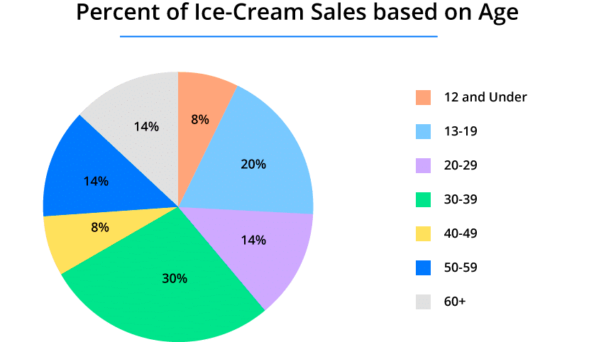
2. Pie chart

Different basic chart types basic chart types

A pie chart depicts a fixed number and how categories reflect a portion of a larger whole – the composition of something. A pie chart depicts percentages of numbers, and the total sum of all parts must equal 100%.

3. Bar chart

Part-to-whole connections are depicted using stacked columns or bar charts. As a result, categories are represented as percentages of the total, and the data in each column (or bar) always adds up to 100%.  

For example, you might use this basic chart type to display survey responses broken down by gender or age group. 

If you need to show multiple part-to-whole relationships (such as how people in different age groups respond to Squid Game), a stacked column or bar chart would allow you to see the breakdowns by the response and compare those breakdowns across the board.

Read how Voxco helped The Logit Group gather robust data set with its sophisticated and flexible platform.

4. Horizontal bar chart

When comparing the means or percentages of eight or more separate groups, a horizontal bar chart is utilized. 

The horizontal bar chart, like the vertical bar chart, should only be used when comparing mutually incompatible groups.  

5. Vertical bar chart

Vertical bar charts are ideal for comparing the means or percentages of two to seven distinct groups. Each bar is divided by a blank space. As a result, the x-axis should be built on a scale with mutually incompatible categories (like multiple-choice, or check-box questions). 

Categories with a continuous scale are more suited for a histogram, but we’ll get to that later. In the case of this basic chart types, respondents could only pick one different option (e.g., daily, weekly…), making its cross-analysis with the other variable ideal for a vertical bar chart.

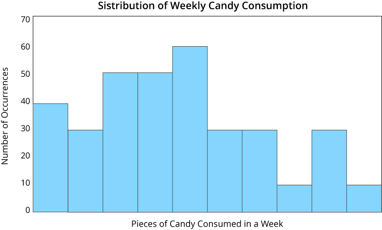
6. Histogram

Different basic chart types basic chart types

Histograms, like pie charts, depict the sample distribution in a single dimension. Histograms vary from other types of charts in that they are suited for presenting sample distributions on dimensions measured using discrete intervals. The x-axis, unlike the horizontal and vertical bar charts, is not separated into mutually incompatible groups.

In our example, the histogram shows how many respondents fell into each category of weekly sweets consumption. The x-axis is a continuous scale, and each bar falls within a range of five units, or candy pieces, on that scale.

What basic chart types are used for different survey questions?

Here are the three types of charts that you can use for survey questions;

1. Binary results

If your survey questions include two binary answers (e.g., yes/no), a pie chart is the most effective visual representation.

The use of pies for binary outcomes is self-explanatory. Simply use a single pie slice to emphasize the proportion of “Yes” replies vs “No” replies.  

If you wish to compare the response rates of different groups, avoid pies in favor of a single bar chart. A series of aligned bars are much easier to compare than a series of pie charts. For clarity, remember to identify each bar with its percentage.

You may break up the bars to construct a type of modified 100% stacked bar chart for a fun, less information-dense alternative. This frees up some room for more descriptive labels for both “Yes” and “No” replies.

Convert data into actionable insights.

See how Voxco Analytics can help you unlock the power of data by helping you build striking visual stories and cross tabs.

2. Rating scales

In a rating scale question, survey respondents are presented with a range of possible replies and asked to choose one. This sort of question is frequently used on customer satisfaction surveys and helps determine customer attitudes about a product or service. The Likert scale & the Net Promoter Score® are the most frequently used rating questions.   The bar chart is the most basic chart type and also the precise way to visualize survey data from rating scale questions. It’s simple to create and displays the proportion of replies in each category.

3. Demographic results

Gathering demographic information is an important part of market research as it helps identify the target market and understand the response from each group. It is equally important to depict the data in a precise and effective way.  Histograms can be used to depict the age distribution of a population. They can easily integrate gender data as well. You can also use pie charts or line charts to visualize demographic data in a more fun way.

How to select the appropriate basic chart type for your data?

  • Determine your data presentation objectives.

  • Determine what data is required to reach your goal.

  • Collect your info.

  • Choose the appropriate graph or graphic.

1. Determine your data presentation objectives.

Do you wish to persuade or clarify something? Are you attempting to display data that assisted you in solving an issue, or are you attempting to express a change that is occurring?

A chart or graph can assist you in comparing different figures, comprehending how distinct components affect the overall, or analyzing patterns.  

2. Determine what data is required to reach your goal.

Different types of data are used in various charts and graphs. Graphs are often used to depict numerical data, whereas charts are visual representations of data that may or may not include numbers.

So, while every graph is a type of chart, not every chart is a graph. If you don’t already have the data you need, you may need to spend some time gathering it before creating your chart.

Trusted by 500 global brands & top 50 MR firms, Voxco powers 100Mn+ surveys annually.

Gather, measure, uncover, and act with the leading insights platform.

3. Collect your data.

Most organizations collect numerical data regularly, but you may need to spend some extra time gathering the appropriate data for your chart. You may require qualitative data in addition to quantitative data tools that track traffic, revenue, and other user data.

4. Choose the appropriate graph or chart.

Using the incorrect visual aid or selecting the most basic chart types might confuse your audience or lead to incorrect data interpretation.

However, a chart is only beneficial to you and your business if it clearly and successfully expresses your argument.

Conclusion

Choose your graphics with care since they might make your data simpler or more difficult to understand. Use a survey platform, such as Voxco, that allows you to view your data represented in several chart kinds. When presenting survey results, visualizations are quite important. As a result, always plan out the story you want to tell with your data and select the basic chart type to present that information quickly and effectively.

Discover the Latest Cutting-Edge Survey Features for Informed Decision-Making

✓ Drag-and-drop Interface 

✓ 100+ Question Types 

✓ Skip Logic and Branching

Voxco is trusted by Top 50 Market Research firms, Global Brands & Universities in 40 countries. Voxco offers full omnichannel capability including CATI, Predictive Dialler, Online surveys, offline CAPI, and Panel Management.

Follow Voxco on